EAT EVERYTHING GF
Branding, Photography, Advertising
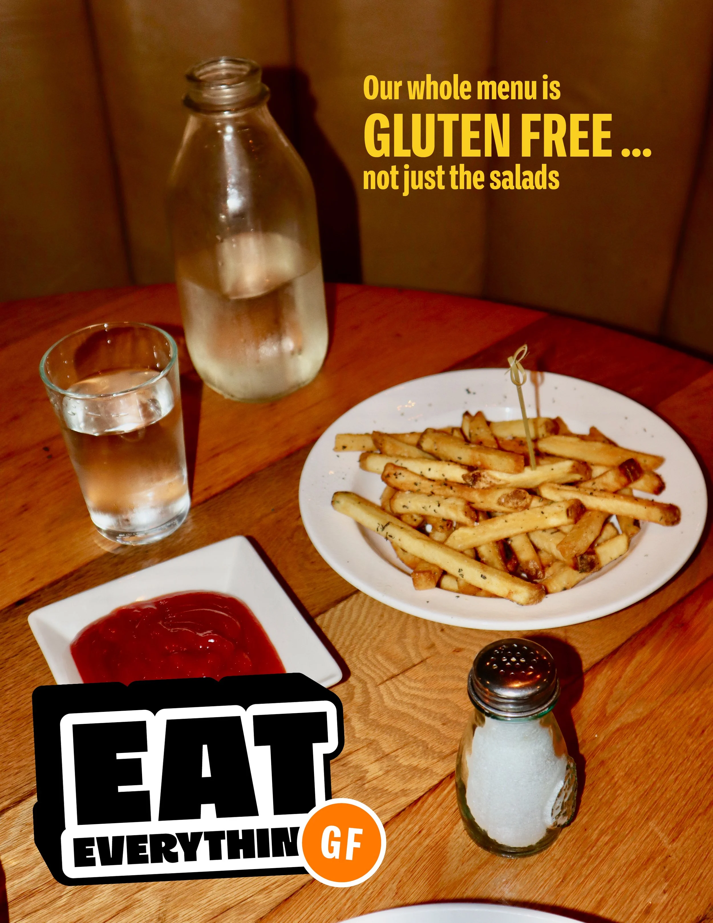
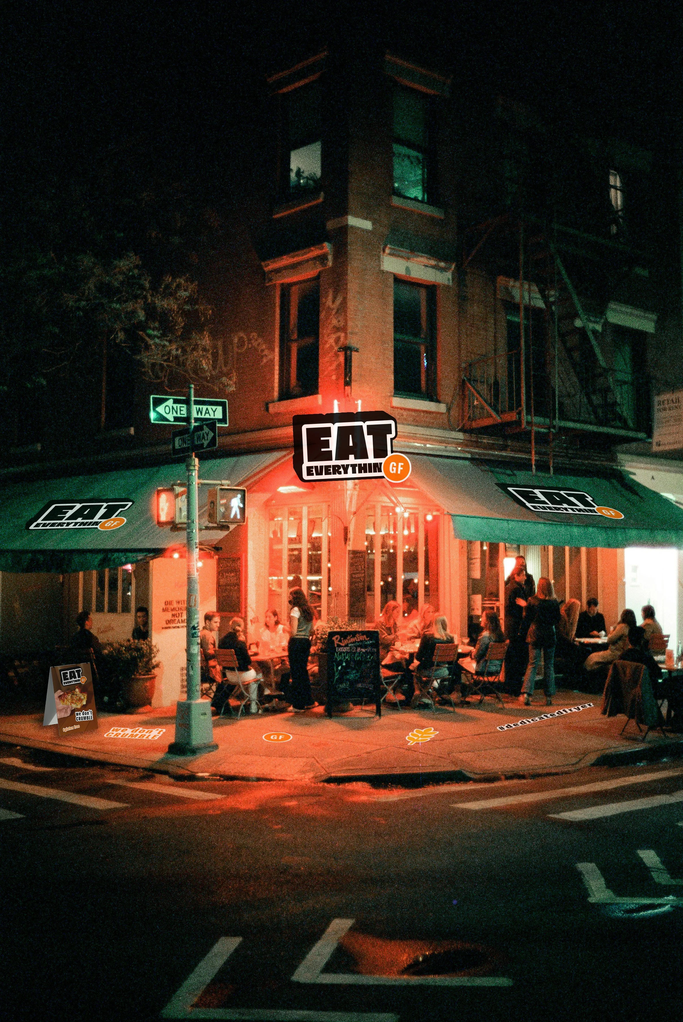
The challenge was to create a bold, personality driven identity for EAT EVERYTHING GF, a fully gluten free restaurant in New York City. The brand needed to break away from the typical “healthy and minimalist” gluten-free aesthetic, instead embracing humor, confidence, and urban energy. Using a punchy “GF” sticker mark as it's core symbol, the goal was to make gluten free food feel exciting and culturally relevant, a place where diners come for the attitude as much as the menu. Designed for young adults who are gluten free and sociallyon trend, the brand had to capture a voice that’s cheeky, trendy, and unafraid to stand out.
-
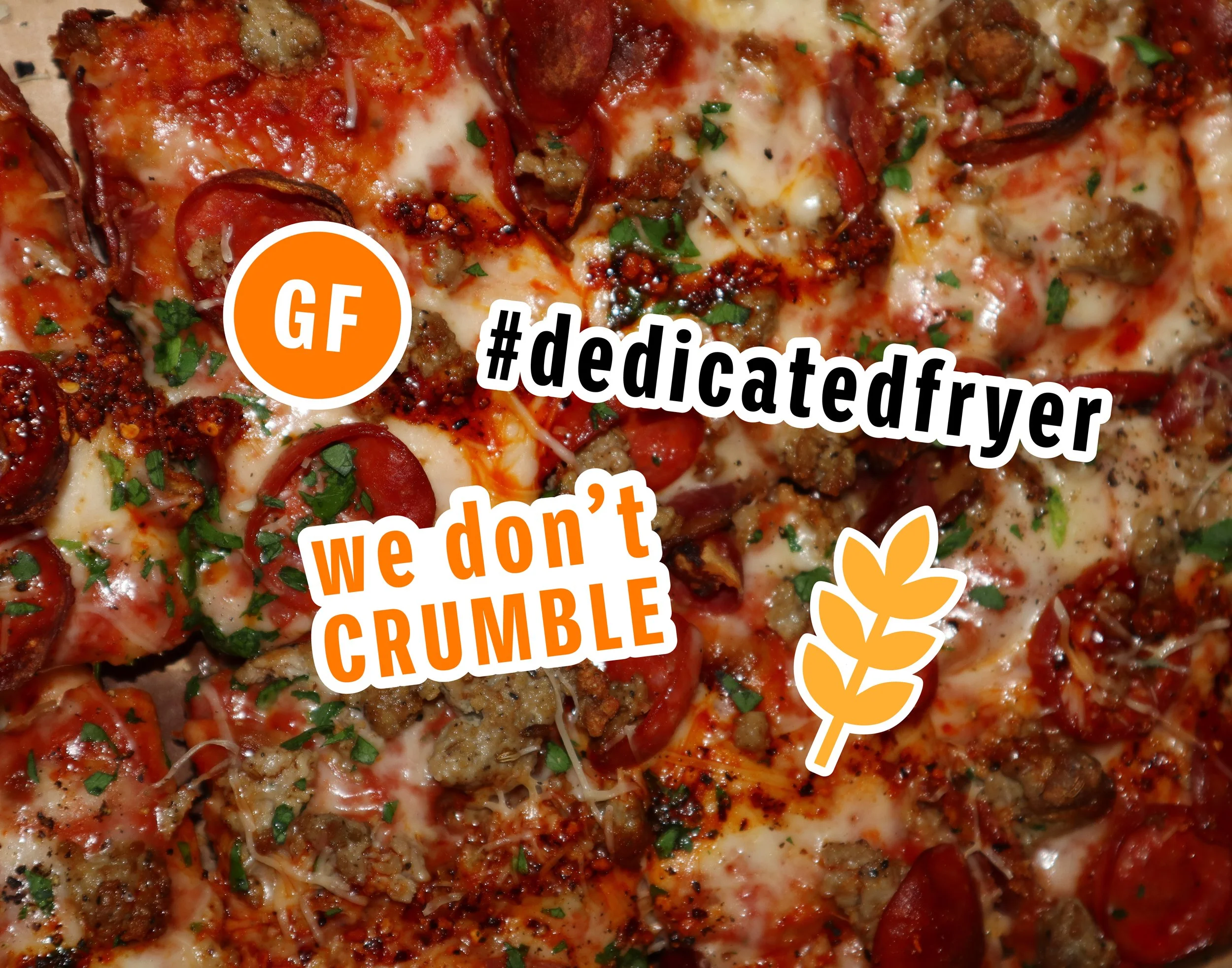
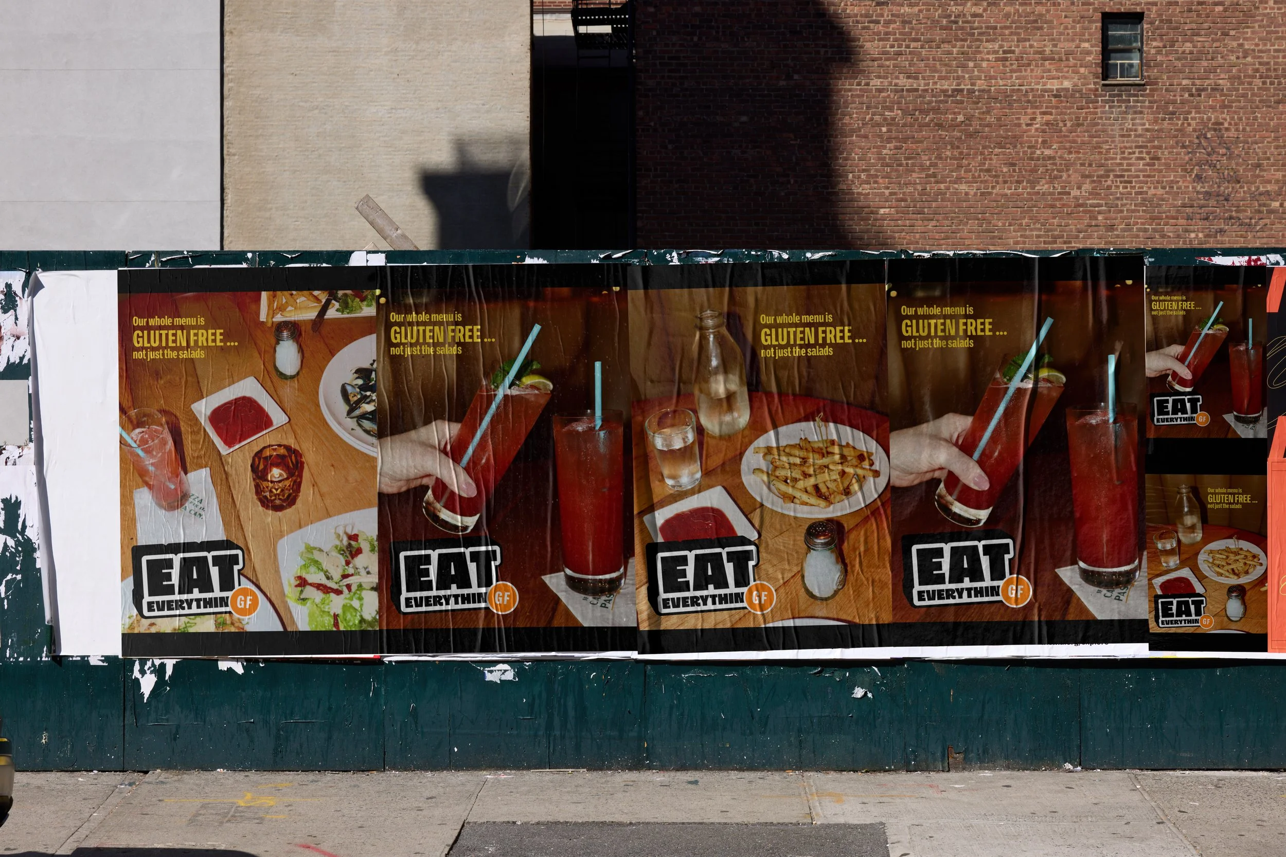
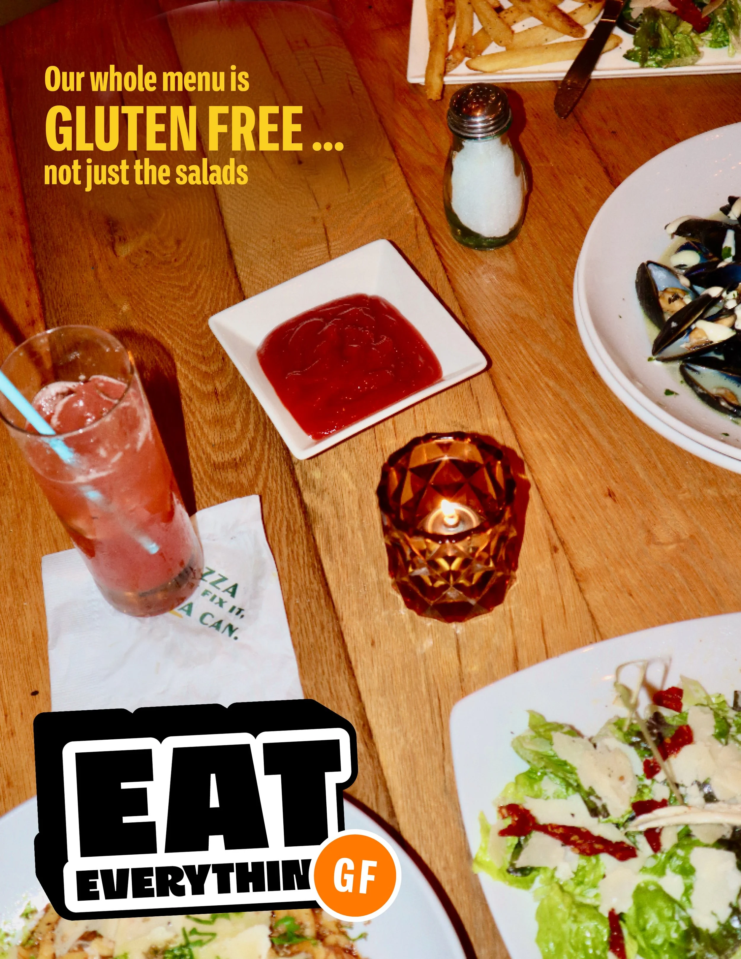
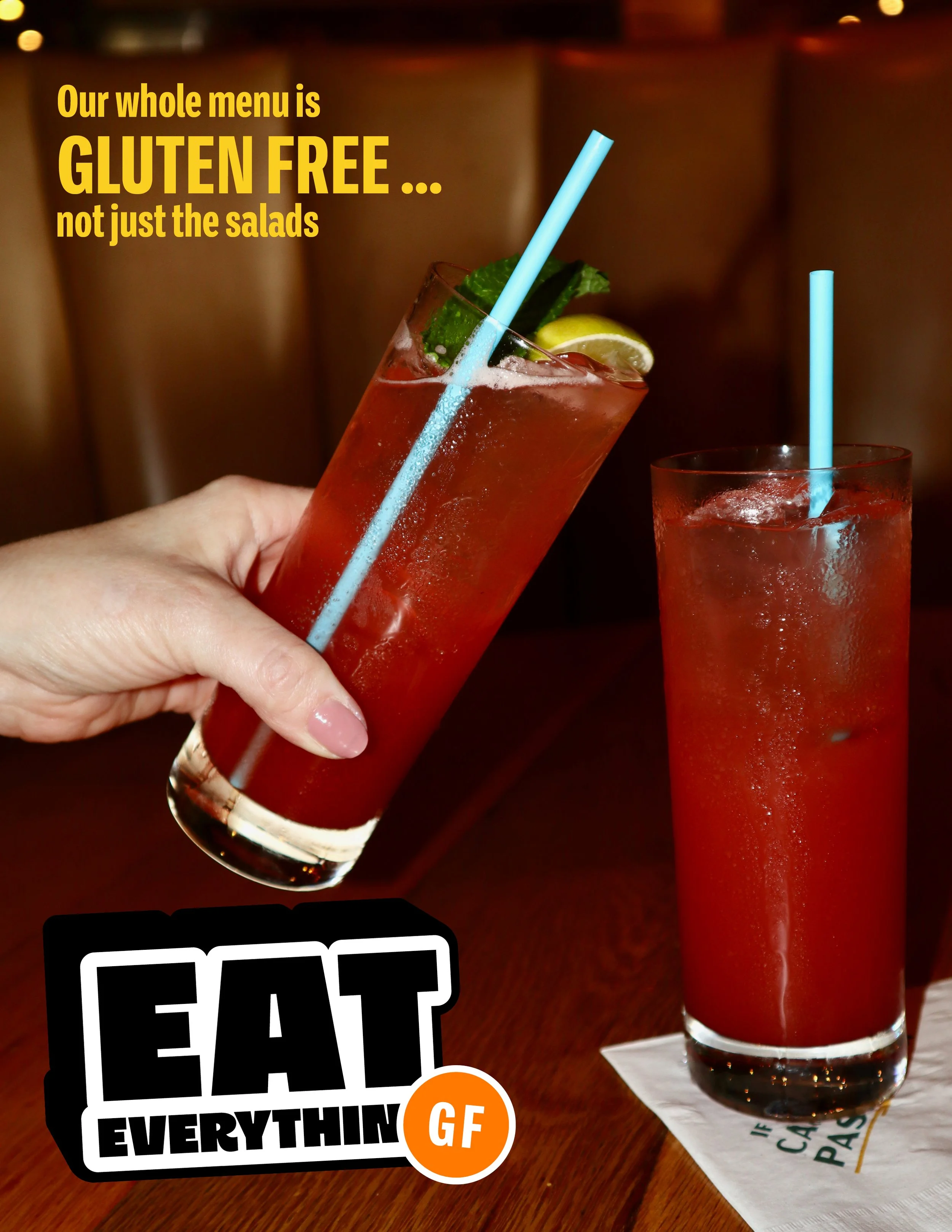
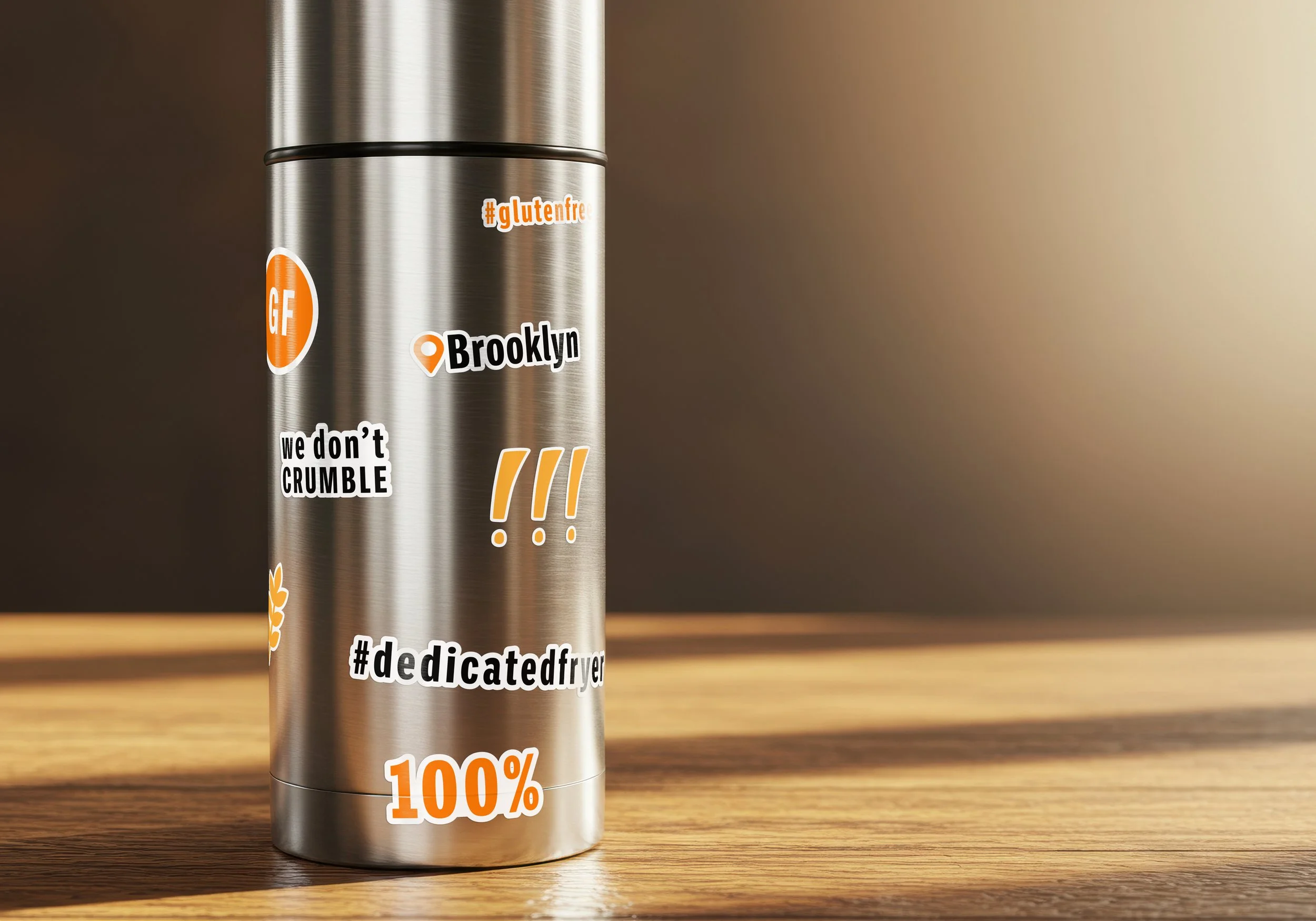
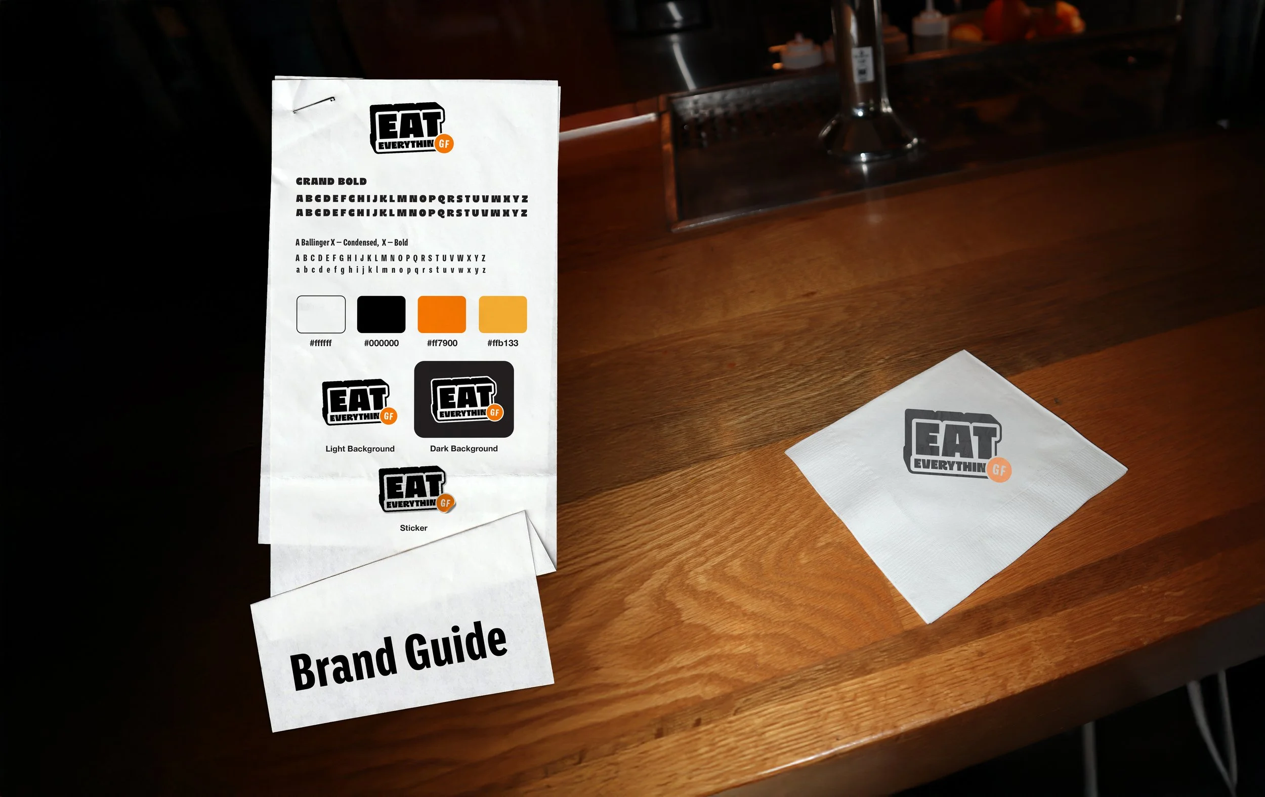
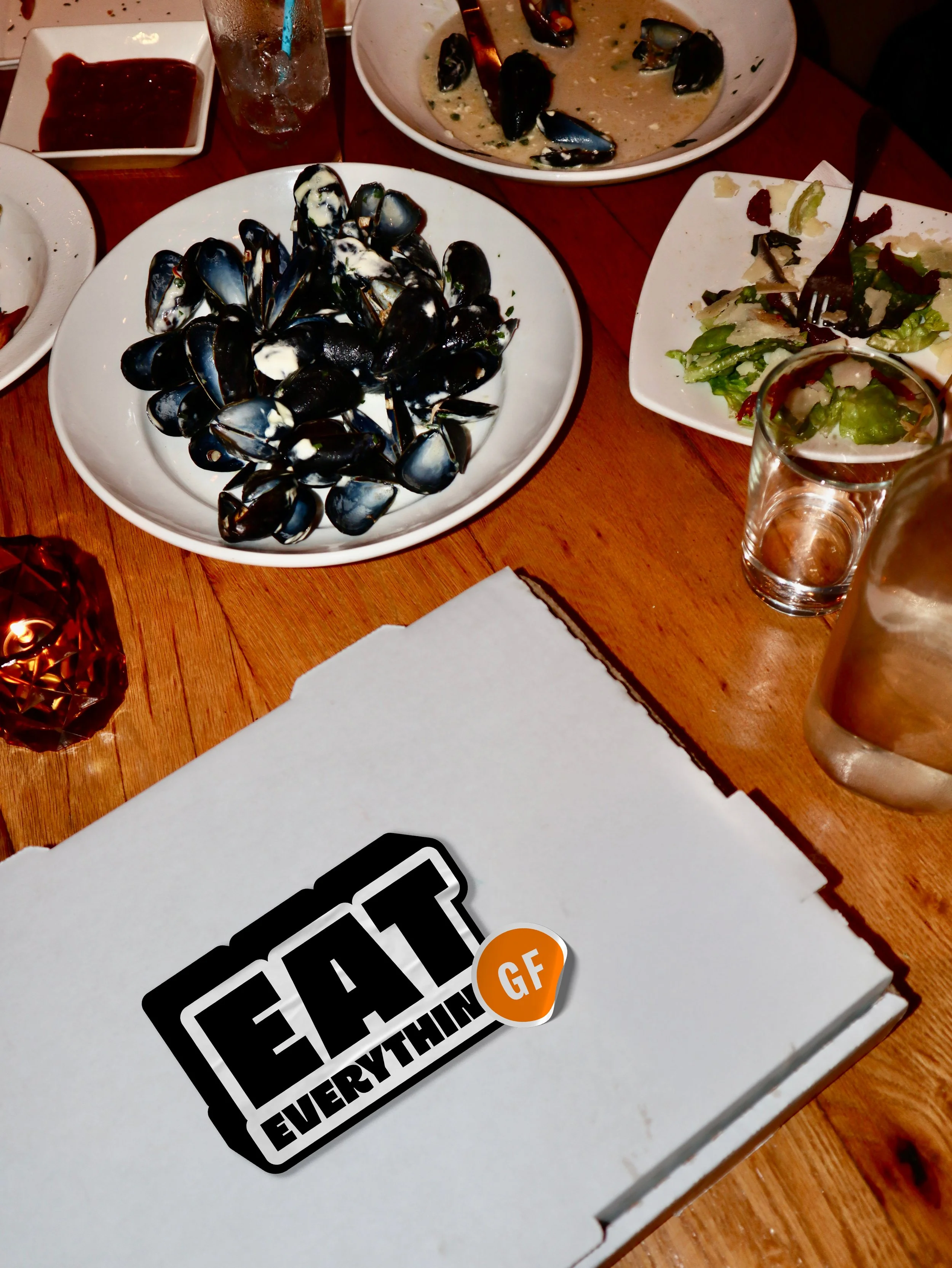
EAT EVERYTHING GF flips the script on gluten free dining with bold typography, saturated color, and an unapologetically confident tone. The brand’s signature black, orange, and white palette channels the grit and vibrancy of Brooklyn, while Impact type reinforces its loud, straightforward personality. The “GF” sticker mark acts as both logo and lifestyle symbol, the kind of design that belongs on packaging, streetwear, or a takeout box. The taglines “#dedicatedfryer” and “we don’t crumble” perfectly captures the brand’s playful defiance of stereotype as the phrase dedicated fryer means alot to the gluten free community and how they don’t crumble is a reference to the stereotype of gluten free bread crumbling. Inviting everyone to join the gluten free scene without losing flavor or fun. The result is a brand that’s not about restriction, but celebration fast, witty, and full of bite.