Shinoda Rebrand & Guidelines
Branding, Social Media
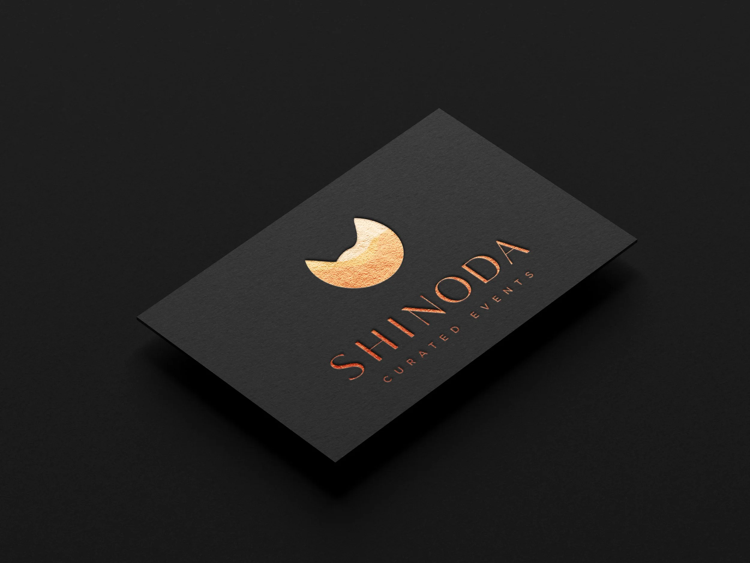
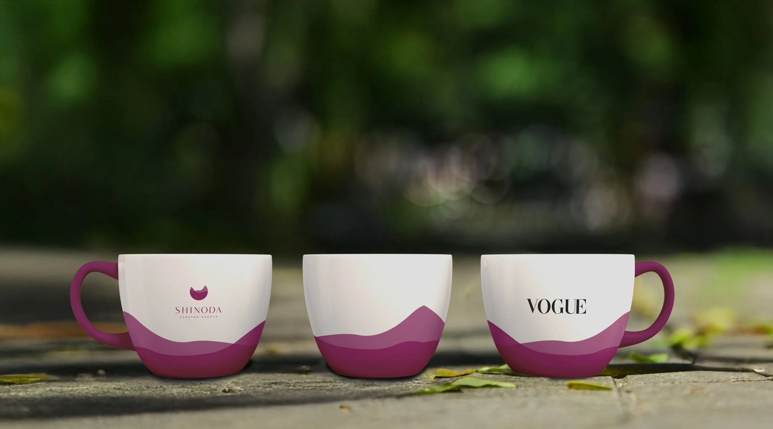
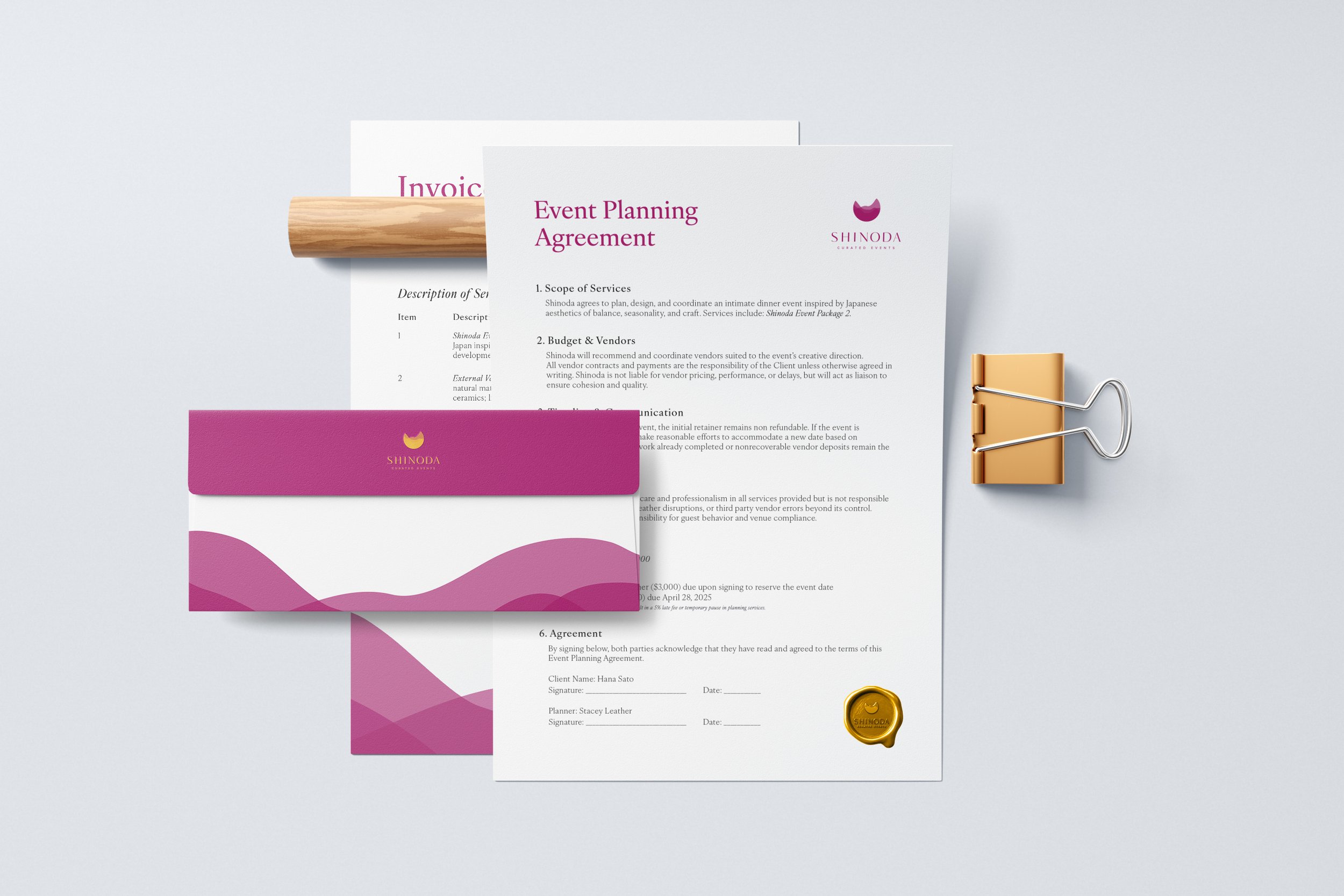
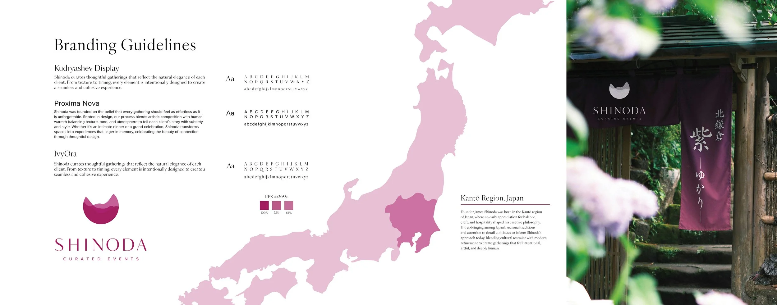
This project reframes Shinoda as a boutique event planning studio that specializes in curated, design led gatherings. The goal was to build a visual identity that communicates calm refinement while supporting a service rooted in personalization and atmosphere all while staying true to the brand’s roots. The design language draws from natural textures, warm minimalism, and soft architectural forms to reflect the brand’s focus on intentional experiences. Also, to bring in elements from it's orgin, Japan, while staying modern yet authentic. Targeted toward clients seeking elevated, aesthetically cohesive celebrations, such as private clients, brands, and creative professionals.
-
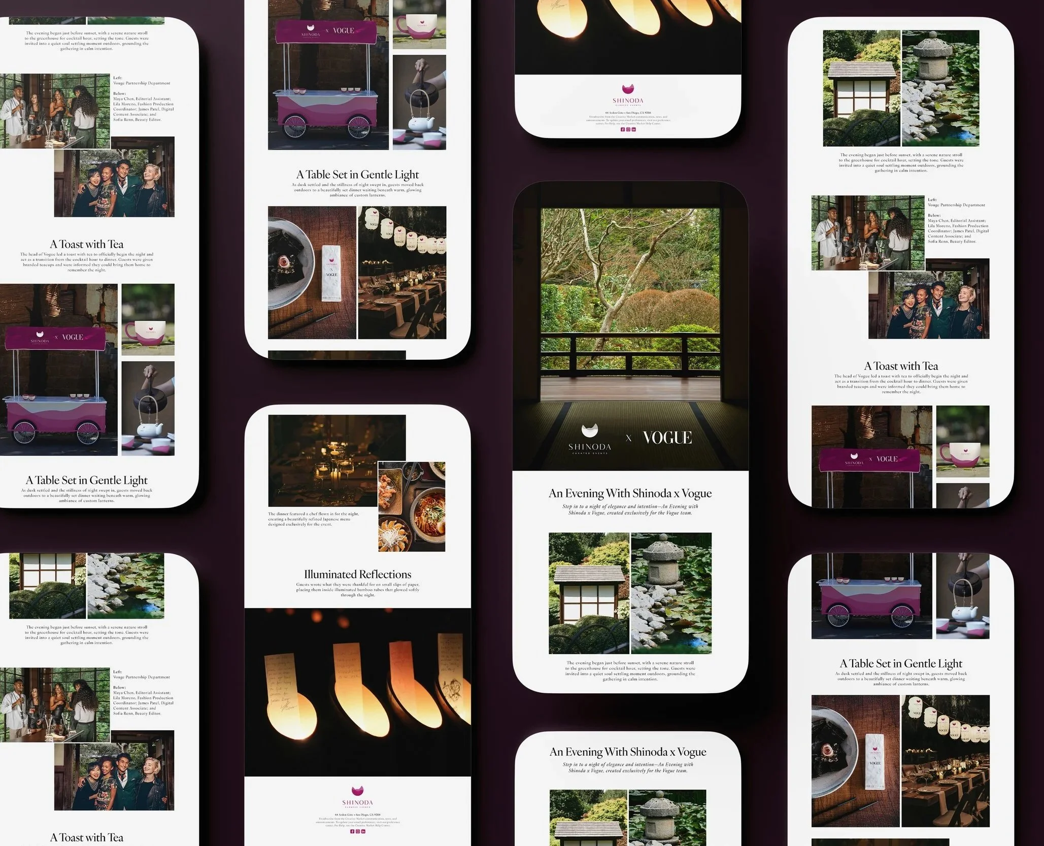
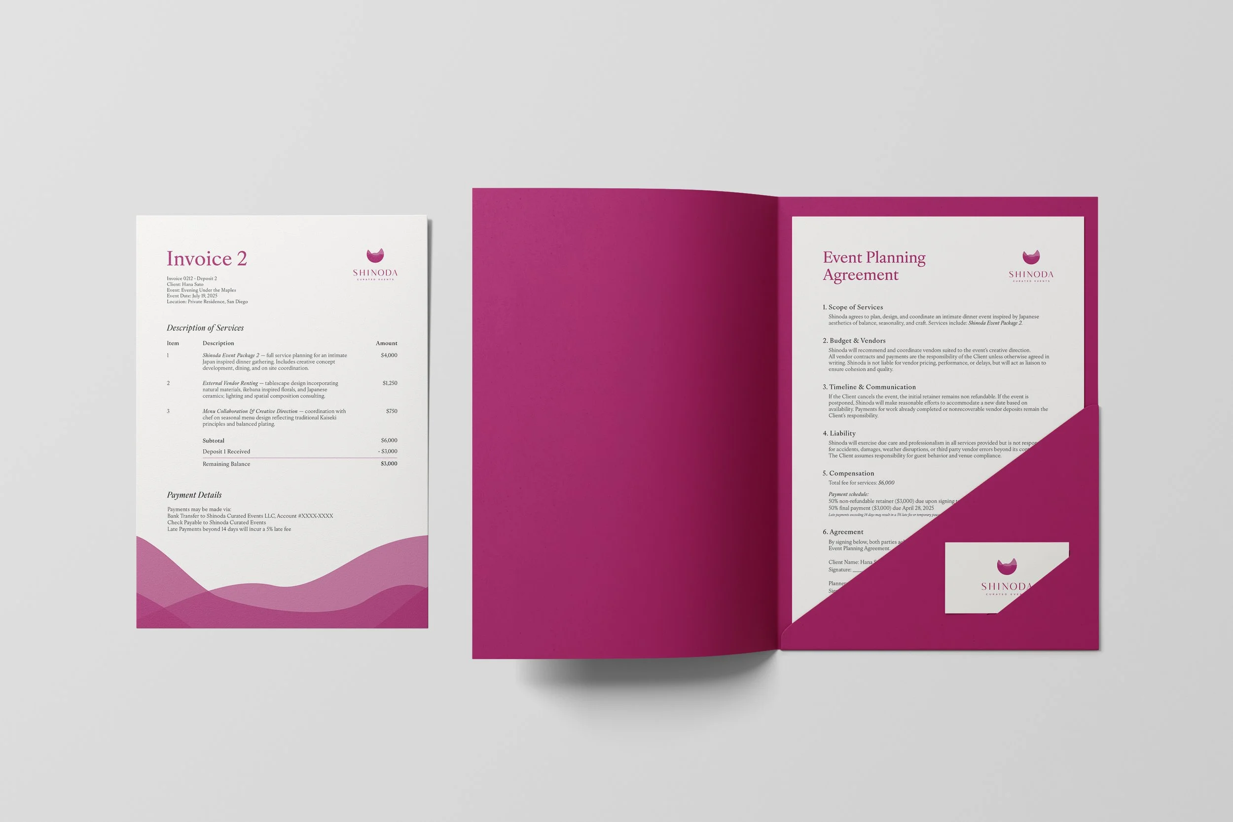
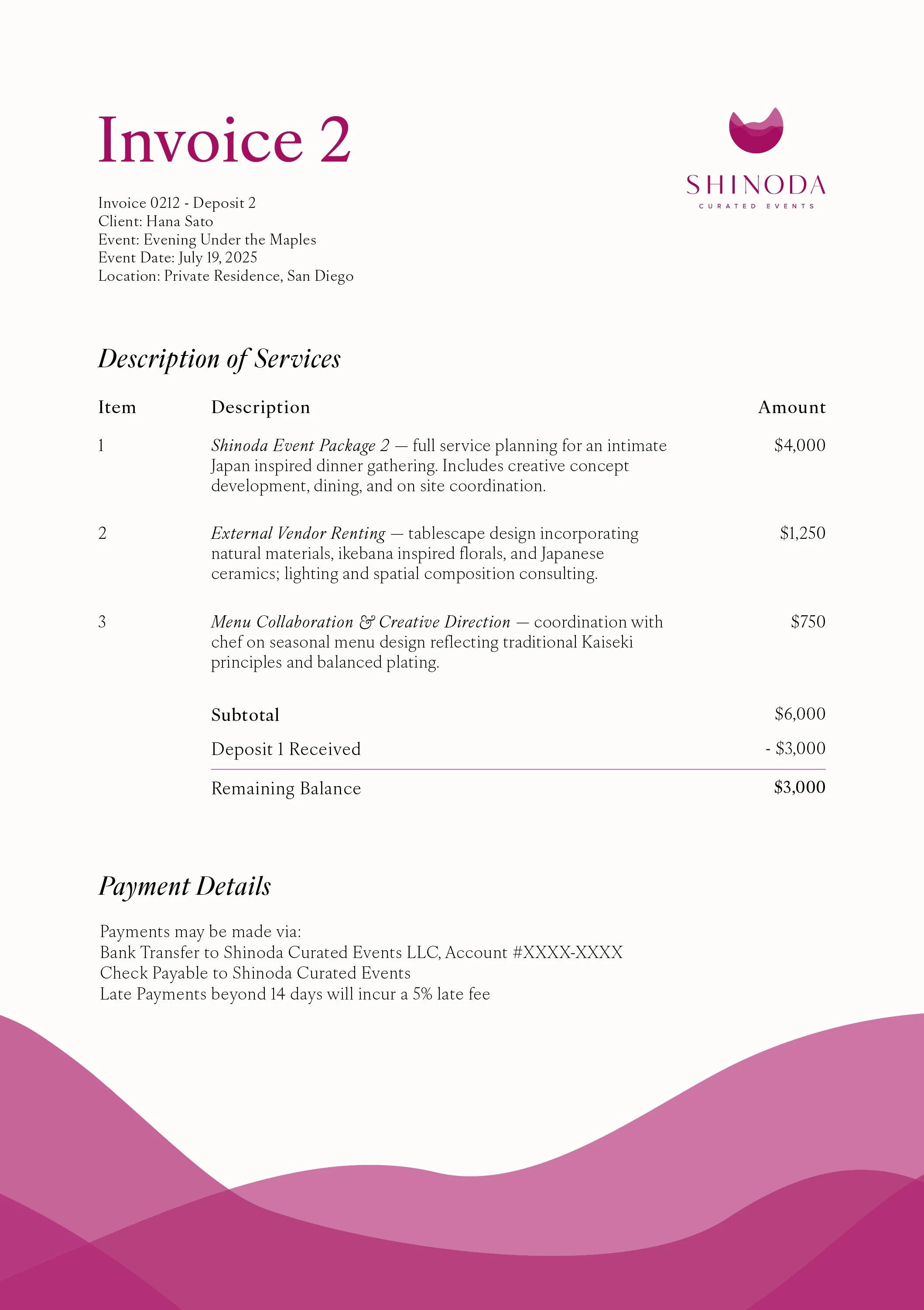
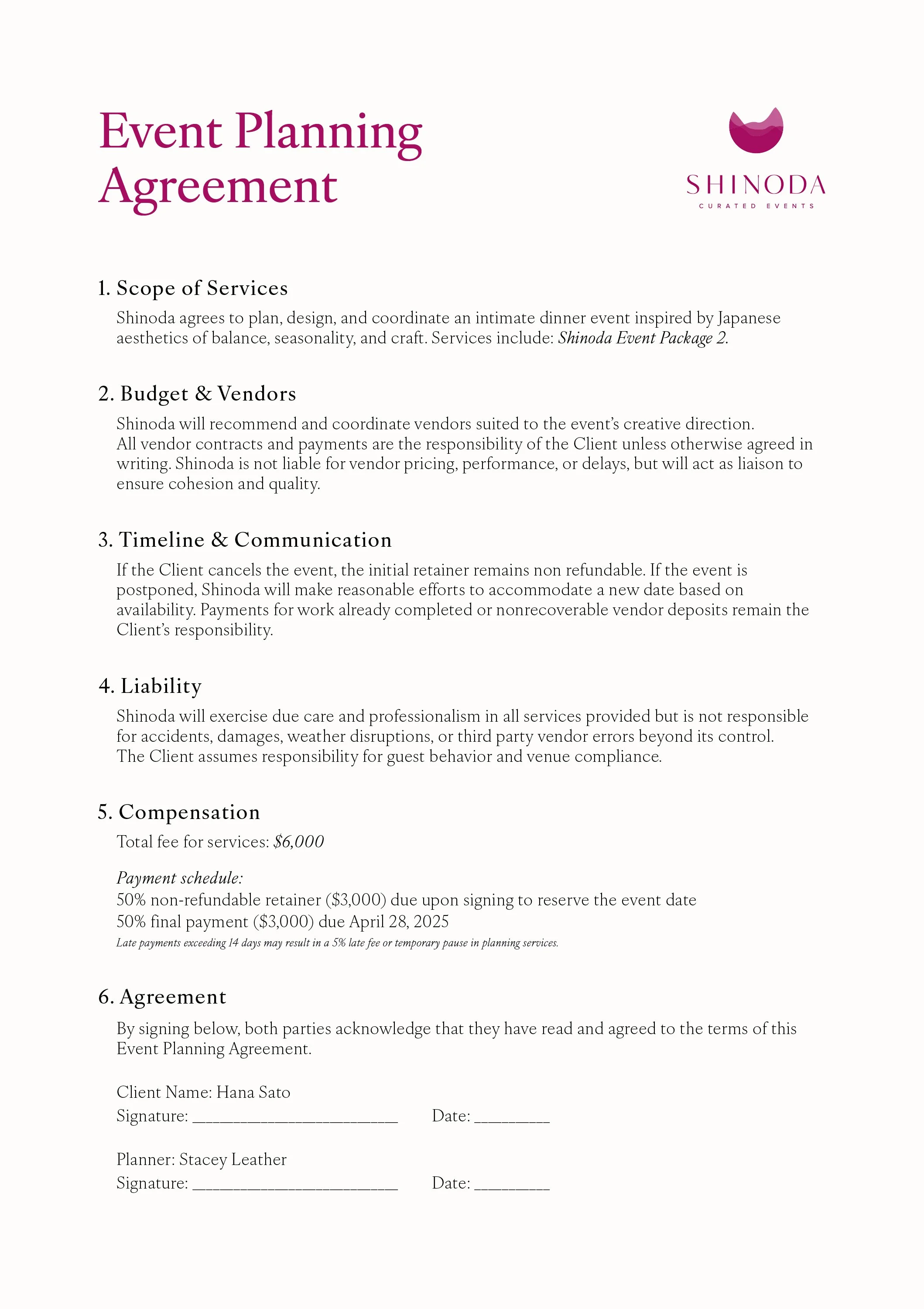
The main challenge was transitioning Shinoda from its previous positioning of a warehouse style studio into an experience focused service brand while expanding elements already present in the brand but elevating sophistication. This required rethinking how the identity functions across proposals, event materials, environmental signage, and digital communication. The brand also needed to appeal to a wide range of clients, from design conscious individuals to organizations planning intimate or specialized events. Balancing artistry with clarity became essential: the system had to look elevated and atmospheric while remaining highly functional and easy to navigate. Developing a cohesive visual structure spanning logo extensions, typography, color palette, and environmental renderings was key to achieving a unified, brand presence.

